
November ONLY: 35% OFF
APS IS OFFERING 35% OFF ALL ITEMS GET YOUR QUOTE NOW
APS IS OFFERING 35% OFF ALL ITEMS GET YOUR QUOTE NOW

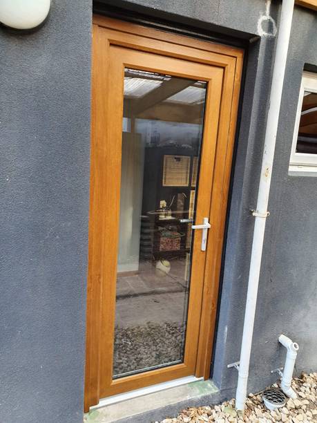
The front door is the first thing most people notice about a home, and its colour is the first thing they notice about the door. That first impression the door makes sets the tone for the whole property and shapes how visitors, passers-by and buyers read it in seconds, so colour plays a big part in your home’s curb appeal (kerb appeal) and in creating an inviting entryway.
Most content on this topic turns it into a personality quiz. This guide covers what the main colours signal in cultural, psychological and design terms, then gets practical about how to choose the right shade for your home.
If you’re also thinking about the door itself alongside the colour decision, our guides to double glazed front entrance doors and double glazed French doors cover the product options in detail — useful reading if you’re considering an upgrade at the same time as rethinking the colour.
What a colour “means” depends on whether you’re talking about psychology, culture or design.
There’s genuine colour psychology behind some associations. Warm tones like red and orange are physiologically stimulating — they increase alertness and create a sense of energy and activity. Cool blues and greens tend to have a calming effect and are associated with stability. These responses are reasonably consistent across cultures and are documented in psychological research. Many people also describe warm colours as giving an entry positive energy or welcoming energy, even if that’s harder to measure.
Cultural associations are real but variable. A red front door carries hospitality symbolism in parts of the United States and is associated with luck in Chinese tradition; in feng shui, red is considered an auspicious front door colour, and colours are often matched to the direction the door faces. Popular stories also claim that door colours signalled safe houses on the Underground Railroad, or that a red door in Scotland meant the mortgage was paid off, though historians have found little evidence for either. These meanings are interesting, but don’t necessarily translate to Australian suburbia.
What’s most practically relevant in an Australian context is the design signal a colour sends: what it communicates about the home’s character and the person who lives there. That’s a mix of aesthetic convention, cultural shorthand, and genuine emotional response — and it’s more useful to understand it on those terms than as a personality test.
It’s also worth thinking about how the front door colour fits into the broader look of your windows and doors, especially in modern homes where consistency in materials and finishes makes a noticeable difference. This guide to the aesthetics of double glazed windows and doors for modern homes explains how to create a more cohesive overall appearance rather than treating each element in isolation.
The following covers the main front door colour families, what each communicates in design and cultural terms, and where each works best in an Australian residential context.
Red is the most historically significant front door colour. A red door reads as welcoming and assured — there’s a reason it’s been used on entrance doors across so many cultures. In Australian homes, it works well on traditional homes, heritage-style properties, Federation-era homes, and any facade with strong symmetry and period character. It’s less at home on very contemporary or minimal designs, where it can feel at odds with the clean restraint of the architecture.
The risk with red is intensity — it makes a bold statement, and if the rest of the facade isn’t strong enough to carry it, it can look like the door is trying harder than everything around it. Choose a red with appropriate depth (burgundy and warm brick red tend to be more enduring than bright fire-engine red), and consider whether the exterior palette supports it.
Orange and terracotta tones are less common but well suited to Australian conditions and architecture. Against natural stone, weathered brick, rendered earthy tones, or natural timber cladding, an orange front door in terracotta or burnt orange reads as warm, down to earth, and distinctly local. The orange door is arguably the most underused option in Australian residential design.
Yellow is joyful and optimistic — genuinely uplifting when used well. A yellow front door feels fun and works on beach-side or coastal homes, on white or pale rendered facades where contrast matters, and on homes with a relaxed, informal character. The risk is that bright yellows can look naive or inconsistent if the rest of the home is more sophisticated. Muted or golden yellows tend to read better than harsh primaries.
Blue covers an enormous range — from the deep navy blue of a serious, formal entry to the soft light blue of a relaxed weatherboard home. A dark blue or navy blue door projects stability, trustworthiness, and considered restraint. Mid-toned blues suggest approachability without high contrast. Soft sky and duck-egg blues suit coastal and informal homes.
A blue front door is one of the most consistently well-regarded choices for resale value, primarily because it’s widely appealing without being confrontational. If you’re in any doubt and the home is going to market, a well-chosen deep navy blue is a safe bet.
Green is having a significant moment in Australian residential design. Sage, olive, and muted forest greens are appearing widely on both contemporary and period homes. A green front door reads as natural, composed, and connected to nature, which suits Australian design sensibility well. In the garden-adjacent entry zones typical of Australian homes, the right green front door color often feels organic rather than contrived.
Avoid very bright or lime green for a front door, as they tend to date quickly and can feel visually jarring.
A black front door is sophisticated, defined, and among the most reliable choices for contemporary homes. The color black creates a strong contrast against almost any facade — white render, pale weatherboard, light brick — and it reads as deliberate and confident rather than conservative. Black doors have been fashionable for some time, and while they’re not completely trend-proof, well-executed black is close to timeless across a wide range of architectural styles.
One practical consideration: black absorbs heat, which in Australian summer conditions means the door surface can reach very high temperatures. Darker colours absorb significantly more radiant energy than lighter ones. This affects paint and material performance over time and is worth considering for exposed north- or west-facing entries. Use high-quality ultraviolet (UV)-resistant exterior paint or powder-coat finish.
A white front door is the safest choice in design terms — clean, fresh, and appropriate for almost any home style. A white door doesn’t create the same entry focal point as a stronger colour, but it contributes to an overall polished appearance without risk. For homes where the facade is already busy with materials, textures, or patterns, white is often an excellent choice.
Charcoal and warm grey occupy similar territory to black but with less contrast and slightly more warmth. A grey (gray front door, in US guides) suits contemporary homes well and has the advantage of being less heat-absorbing than black while retaining a sophisticated quality.
Natural timber and wood tones are worth including here as a distinct category. An entrance door in natural or stained timber doesn’t require a colour choice; instead, it contributes warmth and materiality. This works particularly well on homes with natural material palettes — stone, exposed brick, timber cladding — where a painted door might feel incongruous.
A purple front door in its darker forms — plum, aubergine, deep violet — signals individuality and suits a confident risk taker. Used with restraint and on the right home (typically one with some character and colour already present), it can be striking. Bright or mid-tone purples tend to read as more difficult to live with over time.
Teal and dusty blue-greens have strong coastal associations in Australia and suit relaxed, natural-material homes extremely well. They’re not quite green and not quite blue, which gives them a genuinely distinctive character without being demanding.
A pink front door in dusty or terracotta-inflected tones is appearing increasingly in contemporary Australian design. A pink door suits rendered homes, particularly in suburban and inner-urban contexts, and helps the door stand out without shouting.
Understanding what colours mean is only half the equation. The other half is choosing the right one for your specific home, and that requires considering a few practical factors.
What colours are already on the facade — the render, brick, cladding, roof, window frames, and gutters? Your front door colour should either harmonise with that palette or provide deliberate contrast. The mistake is choosing a colour that neither harmonises nor contrasts — one that simply looks accidental. The interior face of the door can be a different colour to suit the hallway, so the exterior choice only has to work with the facade.
A Federation or Victorian home has an established design vocabulary that certain colours suit naturally (dark greens, burgundy, navy, traditional heritage tones). A contemporary rendered home has more latitude for bold choices. A coastal weatherboard home suits colours that connect to the natural environment. Let the architecture be your guide.
The Australian sun is intense, and colours behave very differently in strong, direct light than in shade. A colour that looks perfect in the morning can look washed out in the afternoon, or vice versa. Test large paint samples on the actual door (or at least on a board held against it) at different times of day before committing.
In Australian UV conditions, exterior paint fades faster than in temperate climates. Very saturated or dark colours tend to show fading more noticeably than mid-tones. If you’re using timber, ensure the finish is appropriate for exterior UV exposure. Powder-coated aluminium, fibreglass, and uPVC with colour-through or foil finishes hold their colour better than painted timber in high-UV environments.
A highly expressive colour that perfectly represents your personality at the time might feel like a commitment you’re less enthusiastic about in five years, particularly if you’re likely to sell the property. Neutral and classic choices have the advantage of ageing gracefully; bold choices often require more deliberate commitment.
A few factors are particularly relevant to Australian homes that don’t feature prominently in overseas guides.
Sun fading is a genuine issue. In high-UV climates, exterior paint colours will shift over time, particularly reds, which can fade toward a brownish tone if a UV-stable product isn’t used. Coastal environments add salt-laden air to the challenge, particularly for metal doors and hardware. Specify marine-grade finishes and hardware in coastal locations.
Australian residential architecture spans an enormous range — from Victorian and Federation terraces in inner-city suburbs to contemporary beach houses, brick veneer suburban homes, Queenslanders, rural homesteads, and everything in between. The right colour for each context is genuinely different, and generic advice about “what’s most popular” is less useful than a colour decision grounded in the specific home and its surroundings.
A few missteps account for most front door colour decisions that don’t hold up over time. These are the ones worth understanding before committing.
Trends in front door colours do move — what feels contemporary now may feel dated sooner than expected. The most enduring choices are rooted in the architecture of the home rather than the current colour zeitgeist.
A beige facade and a “beige” door can look completely wrong together if one has pink undertones and the other has yellow undertones. Getting undertones right is the difference between a palette that looks composed and one that looks slightly off.
If there’s already a lot happening on the facade — multiple materials, window grilles, decorative elements — a very bold door colour adds to the visual complexity rather than providing a resolved focal point.
The direct evidence is mixed, but the indirect connection is clear. First impressions strongly influence how buyers perceive a home, and the front entry is where that impression forms. A front door that reads as considered, well-maintained, and appropriate to the home’s character contributes positively to overall presentation. One that seems inconsistent with the home, poorly maintained, or in an awkward colour can undermine an otherwise strong property.
For resale, the safest choices are colours that are appropriate to the home’s style and broadly appealing — classic navy, black, deep green, charcoal, and considered neutrals. The goal isn’t to make a personal statement but to make the home as appealing as possible to the widest audience.
Front door colour matters because it communicates instantly, to visitors, buyers and the street. Its meaning is a mix of psychology, cultural convention and design signal, and knowing that helps you choose with intent.
The best colour suits the home’s architecture, fits the exterior palette, holds up in Australian sun and reflects your taste without overreaching. That usually leaves a handful of good options, from timeless navy and black to something more expressive, and testing large samples in natural light is the most useful step before you commit.
If you’re replacing the door as well as the colour, APS Double Glazing supplies and installs double glazed uPVC front and entrance doors across Melbourne in a range of colours and finishes, and the team can help you choose one that makes the entry more inviting.
Red has strong associations with welcome, hospitality, and confidence across several cultures. In practical design terms, it creates a bold focal point and works well on period homes with strong symmetry. Choose a warm brick-red or burgundy rather than a pure primary red for the most enduring result.
Widely appealing neutrals and classics — deep navy, black, charcoal, dark forest green — tend to perform best in property presentation because they’re broadly liked and appropriate to a wide range of home styles. Avoid highly personal or intensely expressive colours when preparing for sale.
Black, charcoal, and dark greens have been widely popular in Australian residential design in recent years, particularly on contemporary homes. Classic white and near-white remain consistently common for their versatility.
It’s not a requirement, but coordination creates a more resolved facade. A front door in the same colour as the window frames creates strong visual cohesion. A contrasting door colour can create a focal point, but it should be deliberate rather than incidental.
Very bright primary colours that are strongly trend-dependent, colours with undertones that clash with the facade, and colours that draw disproportionate attention relative to the rest of the home. In Australian conditions, also be cautious with saturated colours that have poor UV stability, which will fade unevenly.
Use a high-quality exterior-grade paint or powder-coat finish with UV inhibitors. Lighter mid-tones and classic neutrals tend to show fading less than very dark or very saturated colours. For coastal homes, explicitly specify marine-grade finishes.
Directly, the evidence is mixed. Indirectly, yes — the front entry is where first impressions form, and a door colour that suits the home and reads as considered contributes to positive presentation. Poorly chosen colours can make an otherwise good property feel less appealing.